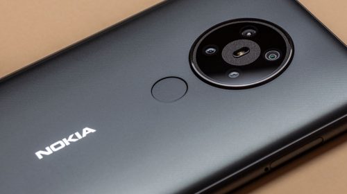
The logo has been redesigned for the first time in decades to help redefine the brand. Nokia has unveiled the newest redesign of its logo, something it hasn’t done in decades, to help place the spotlight on the fact that it is no longer a cell phone company. The company has been working to rebrand itself now that smartphones aren’t what it’s about. The new logo is a clear move away from being a cell phone company. It contains five different shapes which each come together to spell the NOKIA…
Read More
