As you know, responsive web design is part of an evolution of web design that continues to grow to make websites as efficient and marketable as possible. The goal seems simple and familiar: adjust your current site so that it will appear user friendly on every device, from laptops, to Macs, to desktops, smart phones and tablets.
When the type of device is set upon, including the typeface, grids, and images, it will become fitted into the particular screen size. Most of the world is plugged in to the digital world while on the go, and that is why responsive web design has become a crucial part in website creation. The popularity of smart phones and tablets is dictating the creation of websites through responsive web design.
Making Adaptable Websites

The size of computers and cell phones are getting smaller, as well as they are expanding in versions, every day, and that is why websites need to learn how to adapt to being displayed on different devices. Websites will benefit in providing users with an unfragmented experience.
Implementing a responsive web design is a time consuming process; however, it will definitely benefit you in the long run. With the convenience of a responsive web design, there will be no need for numerous redirects or different sites. It aids in easy production of updates because only one will be needed. In addition, visuals will remain constant, no matter what the size. Responsive web designs can help you establish your credibility, and identity for your brand.
Let’s take a look at relative sizing, as it’s key in making a website adaptable to all devices. There is a tried and true method of shrinking the site’s body type when the width of the browser gets smaller. The font size is acknowledged in ems, making everything relative to the site’s body. This will have the impact of extending to the other elements and shrinking them down as well. This is what the approach will look like:
body {
font:1em/1.5em ‘Verdana’, ‘Arial’, sans-serif;
}
@media screen and (max-width:800px) {
body {
font-size:0.8em;
}
}
@media screen and (max-width:400px) {
body {
font-size:0.7em;
}
}
This approach will allow your website to adapt to mobile devices, PCs, tablets, and laptops so that your site will look the same no matter what it’s being viewed on.
Flexibility in Web Design
Make sure to make your responsive web design flexible, so that it translates well to other devices. If your photos, grid, and typeface aren’t flexible, it will hinder your website’s design. You may hide images and content for a mobile site or go for a simple, yet effective layout to maintain a constant, uniform look across all devices.
Flexible layouts do not permit the use of any fixed measurement units, like pixels or inches because the viewport height and width have to continually change from device to device. Fixed values have too many constraints; however, there is a formula to help identify parts of a flexible layout by using relative values. To get the result of the relative width of the target element, use this formula: target ÷ context = result
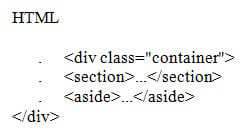
This formula can work inside of a two-column layout. Below, you’ll find a parent division with the class of container wrapping the section and aside elements. The point is to have the section on the left and the aside on the right with equal margins in between. In general, the markup and styles will look similar to this:

CSS
. .container {
. width: 660px;
. }
. section {
. float: left;
. margin: 10px;
. width: 420px;
. }
. aside {
. float: right;
. margin: 10px;
. width: 200px;
}
By using the flexible grid formula, you can take all the fixed units of length, and transform them into relative units. If you take the flexible layout concept, and formula, and redistribute it to all parts of a grid, it will make a comprehensively dynamic website that scales all viewpoint sizes.
If you want further control within a flexible layout, you can leverage the max-width, min-height, max-height, and min-width properties.
Base Your Web Design on Your Grid
The ideal responsive web designs are based around the effectiveness of your grid.
You may add more support to your browser widths that can hold up to 1,000 pixels. In addition, you may also use fluid breakpoints that don’t need predetermined stops, yet, are commanded by the whole design. Here are some guidelines to follow in basing your web design on a grid:
• Try limiting the layout to 960 pixels wide.
• Be cautious about going over 1,000 pixels wide, as it may force your site to utilize a horizontal scrollbar.
• Make your source file about 1,600 pixels wide to allow enough room for a tiled background design.
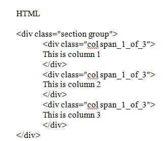
The .section will horizontally split up a page. This comes in handy to break up the content, and you may use it within your main wrapper or other divs. The .col will divide the section into columns. Each of the columns will have a left margin of 1.6% or about 20 pixels on a regular monitor. By using .col:first-child { margin-left: 0: } you will not need to use class=”last” at all. In using @media queries the columns will stack and the margins will disappear when the screen size drops below 480 pixels.
By using a responsive grid system, your site will scale to any width because it uses percentages. The fluid columns will be able to fit any width, and the margins or gutters also use percentages. Mobile versions of the responsive grid system will already be used, and they can also be customized.
The responsive grid system can go all the way up to 12 columns. Here’s a sample code for a 3-column layout:
