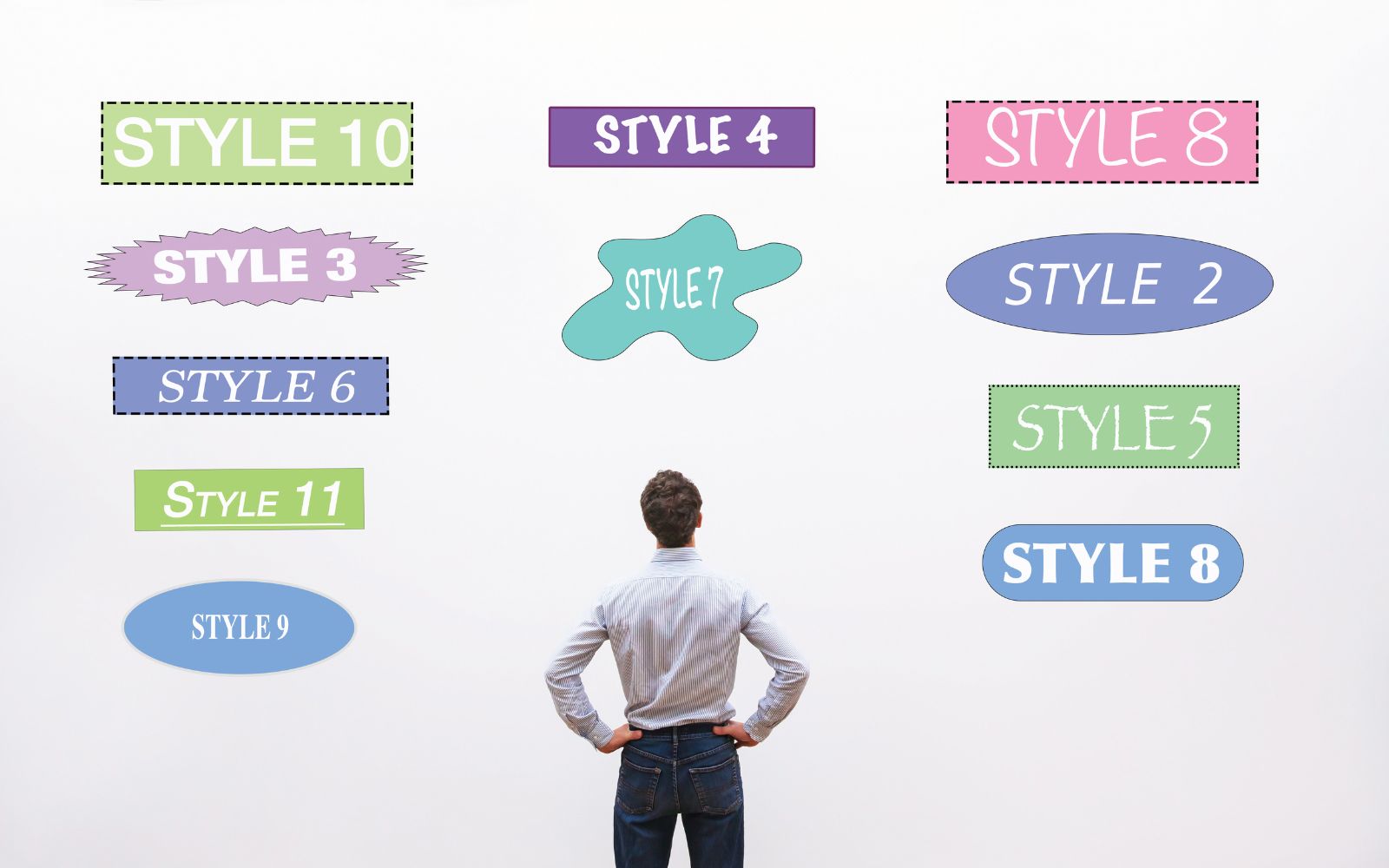
Wondering how to create a good brochure design? Well, the most important aspect of a brochure is that it gets read!
People will casually pick up brochures here and there but never get around to reading them. Why? The content might have been worthwhile, but the brochure itself just wasn’t engaging.
It might have been cluttered with random images, many too small or low-resolution to add any value. Or it might have had a type that wasn’t readable due either to size or typeface. Maybe it just seemed boring.
We’re here to give you a few pointers on how to make a brochure so that your design will draw attention and admiration.
Five Tips for Good Brochure Design
Don’t worry if you’re not an experienced graphic designer. Here is some advice we believe you will find helpful as well as straightforward.
- Have a Simple Color Scheme
Use 3-6 colors (with or without illustrations). For a minimalist look, maybe try two shades of the same color with a third for accents and text.
Choose a darker, less saturated color for the background, since it’s easier on the eyes; a lighter, more saturated version of the same for highlights; and a third for text.
It’s basic but appealing. Search “excellent brochures” (or something similar), and you’re sure to see some examples of this design style.

2. Limit Your Fonts
Two is a good number. Even a standard font such as Calibri Light, a crisp sans-serif font, can make a subtle, yet palpable impact. Read about some other good and poor font choices.
Avoid “decorative” fonts like Comic Sans Serif! Use 12-point font for the body, 10-point font for captions, and 14- to 22-point font for headlines.
Make the text black, white, or the darkest possible shade of another color for informational text and a partially saturated version of the same or a similar font for background accents.
Imagine the letter “T” starting a line of text, with a large, much paler “T” floating behind it, somewhat off center.
- Use Positive and Negative Space
Take what you know about positive and negative space and use these attributes to your advantage. Few things are more eye-catching than “cut-out” images on a solid-color background.
- Use a Limited Number of Excellent Photos
If you can’t take good photos, try stock photos. Better yet, hire a freelance photographer.
- Use a Template
Get a little design assistance from professional designers by using a template. There is quite a selection of these available online, including brochure templates from Adobe Express. Why not try these out!
Ready to Fold and Mail?
This is hardly all you would need to learn about how to make a good brochure, but what we’ve shared should give you a good start. You can achieve some great looks with simple design ideas.
Some keys to good beginner design include:
- Don’t overdo it.
- If it doesn’t seem right to you, it probably won’t to other people, either.
- If you get frustrated, remember that you can choose a nice-looking template.
Check out the marketing section of our blog for more great ideas on how to market your business.

